What should be the main page of the site?
 The main page of the site is one of the most important pages, which is responsible for everything: will the user stay on the site, will he like the web site, will the company and the company be interested in his offer? A huge responsibility is placed on the main page. It depends on the first impression of the entire site and the user’s desire to stay on it or leave.
And now once again look through the main page of your site and think about whether it creates the impression that is required of it?
What is the value of the main site?
You will not have a second chance to make or change your first impression a second time. You will not be able to convince a visitor of your site that you are, in fact, a more serious and promising company than it seems when you look at the start page. The home page of the site is your opportunity to tell the potential client who you are, what you offer, why you are better than your competitors and why the visitor should even contact you.
As the face of the site, the home page performs several key tasks:
Informational – makes it clear to the visitor of the site where he got, what the company does, what it offers;
Guide – using the menu, navigation and active buttons allows the user to quickly navigate and move around the site in search of information of interest. This makes the site easier and more understandable for the person;
Marketing – increases the credibility of the company by demonstrating its benefits, benefits to the user, as well as high-quality advertising of basic goods or services;
Communicative – allows you to interact with customers using integrated social networks, online assistant functions or feedback forms.
In fact, the main page performs the tasks of the landing page. It should have a logical and selling structure and other conversion elements (we will talk about them later). The only thing that distinguishes the main page from the landing page is a larger amount of content and functionality.
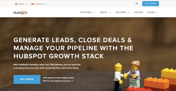
How beautiful to make the home page of the site – we take ideas from popular brands
What should the visitor find on the main page of the site first?
Your potential client goes to the main page of the site. You have no more than 10 seconds to delay it and force further surfing the pages. How to do it? Correctly submit information and answer his questions, which he has already formed.
Who you are?
Give your visitor a loud and clear answer that you are for the company, as it is called. Do not force your potential client to wander around the page in search of this main answer. Believe me, only one visitor out of 100 will spend their time searching. Therefore, clearly indicate the name of the company and place its logo at the beginning of the page in the most visible place – in the upper left corner or in the middle.
What should be on the main page of the site?
This requirement is relevant for all sites, regardless of their purpose. Even on the information portal should indicate its name.
What does your company do?
Do not pull or create intrigue, but immediately tell your consumer what you are doing. A person must understand whether he has reached the site and take further action.
It doesn’t matter if you are selling a product, service or website that is not for commercial purposes – tell the visitor about it. You can tell about your activity in different ways, most often this is a brief description of the activity in the banner or near the logo. This is up to you, as long as the user understands it. And do not forget that brevity – the sister of talent. Here sprayed to nothing.
It is important to arrange a stylish home page of the site – since this is your business card
What is offered to me?
The answer to this question should be visible to the consumer in the very first fraction of a second. It does not matter whether the website is large with hundreds of pages or a small resource intended for the sale of several services. Make the user see what is being offered to him. Take out the main offer to the visual part of the page. If this is an online store, then show a few products or a catalog. A person with a visual perception of the goods immediately raises the question of how much it costs. Why not provide him with this information?
Do not forget about the convenience of the site. If it is large, then it is impossible to provide data on all goods and services offered by the company. Therefore, it is necessary to work out the navigation, so that the user can conveniently browse through the categories and find out what he can purchase with the help of your resource.
Develop the design of the home page is better through the layout
Why should I trust you?
At the sight of the Coca-Cola logo, the user already understands that in front of him is a famous, time-tested company that produces delicious drinks and products. In the meantime, your brand cannot speak for you, you need to create conditions for your potential client to build confidence in you. This will help the blocks of benefits, where you can tell how your company differs from its competitors, a block of benefits with information about the values that the consumer will receive.


